Colour can completely change how a house feels from the outside. A flat, single shade often hides the details that make architecture special, while a thoughtful mix of tones brings life to trim, windows, and doors. With creative combinations, exterior painting becomes more than maintenance—it becomes a chance to showcase character and make the home stand out on the street.
Contrasting Trim and Siding Tones That Sharpen Architectural Lines
One of the most effective ways to elevate curb appeal is through contrast. Choosing a trim colour that sharply defines itself against the siding highlights the edges of the home. For example, a white trim around deep navy siding makes each line crisp, while darker borders around light siding add bold definition. This technique makes proportions appear stronger and reveals the geometry of the structure more clearly.
Homeowners often overlook just how transformative trim can be. Subtle contrasts work beautifully for traditional houses, while dramatic pairings can modernize older styles. By experimenting with balance, exterior painting with contrasting trim and siding becomes a tool that frames the house like a piece of art, drawing attention to details that might otherwise blend away.
Warm and Cool Colour Blends That Balance Modern Character with Natural Surroundings
Warm and cool tones, when paired thoughtfully, create harmony between the home and its environment. A warm earthy brown paired with a cool slate blue delivers a grounded yet modern feel. Similarly, soft grays with pale beige accents create a subtle balance that feels current while still welcoming. These pairings give a house both presence and calmness.
This approach works especially well for homes situated in natural settings. The mix of warm and cool tones allows the house to settle comfortably into the landscape without disappearing. With exterior painting, blending these shades creates a balance that feels timeless and fresh at the same time.
Multi-tone Facades That Highlight Gables and Roof Details with Subtle Depth
Gables, dormers, and other roofline details often disappear when painted in one uniform shade. Multi-tone facades use carefully chosen secondary colours to highlight these elements. A neutral base can be accented with a deeper or lighter tone on gables, making them pop without overwhelming the eye. This gives the house depth and architectural richness.
The beauty of this idea is how flexible it can be. Homes with steep rooflines or detailed trim work benefit greatly because the extra tones emphasize their complexity. By breaking up a large facade with secondary shades, exterior painting transforms even simple structures into layered, visually engaging homes.
Earth-inspired Palettes That Connect Exterior Walls to Landscape Elements
Earthy palettes rooted in natural colours create an instant sense of belonging. Shades of terracotta, mossy green, or sandstone echo the tones of the environment, linking the home visually to its surroundings. This approach makes a house feel as though it has grown naturally into its setting rather than standing apart from it.
Earth-inspired palettes also have the advantage of aging gracefully. Because these tones mimic natural elements, they look fresh through seasonal changes. Exterior painting in earth tones allows homes to blend with gardens, stone pathways, or wooded lots, creating continuity between the built and natural world.
Layered Accent Colours That Bring out Window Frames and Entryways with Distinction
Layering colours around key architectural features like windows and doors gives them distinction. A soft main body tone can be paired with a deeper shade around frames, while a third, brighter accent highlights sashes or mullions. This layering pulls focus to the openings and adds rhythm across the facade.
Entryways benefit most from layered colours. Using one shade on the surrounding trim and another on the door frame draws visitors toward the entry without overpowering the rest of the house. With careful balance, exterior painting in layered tones brings subtle sophistication and turns ordinary frames into statements.

Bold Front Door Tones That Create a Focal Point Without Overpowering the Scheme
A bold front door colour is often the simplest and most impactful upgrade. Rich red, vibrant teal, or even sunny yellow draws the eye and sets the mood immediately. It anchors the design, giving the home personality without requiring major changes to the rest of the facade.
The trick lies in balance. While the door is bold, the surrounding colours remain complementary and understated. This prevents the focal point from overwhelming the design. Many homeowners find that exterior painting in this way creates a warm welcome and makes the entry a memorable feature.
Complementary Shades Across Porch Railings and Columns
Porch railings and columns often fade into the background, but colour can give them a voice. Using complementary shades—such as pairing a muted green with a crisp white railing—enhances the architectural rhythm. The vertical and horizontal elements of porches suddenly stand out, offering structure and elegance.
This technique also helps unify the home’s front elevation. Railings and columns painted with thoughtful colour pairings connect seamlessly with siding and trim, tying the facade together. With exterior painting, the porch becomes more than a functional space; it becomes part of the home’s identity.
Gradient-inspired Transitions That Soften Large Surfaces with Visual Flow
Large walls can appear flat and heavy when painted a single shade. Gradient transitions, where colours gradually shift from one tone to another, soften the scale and add visual interest. For example, a base wall in warm taupe that fades into a lighter sandy beige at the top creates a sense of height and lightness.
This approach requires skill but offers a unique result. Gradient-inspired exterior painting brings movement to otherwise static surfaces. It works especially well on wide facades or homes with minimal architectural detail, giving them character without adding physical ornamentation.
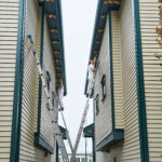
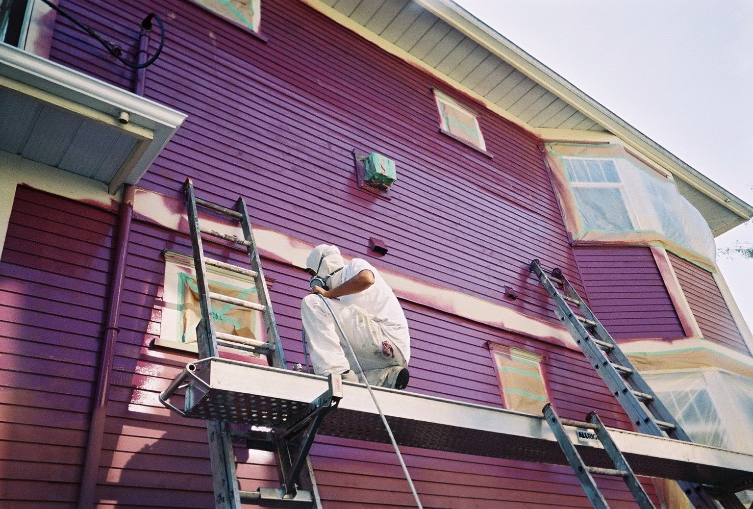
Achieve Lasting Color, Superior Protection, and a Beautiful Finish From Start to End with Pro Crew Painting
Designing with multiple colour tones sounds exciting, but execution is where the difference shows. Pro Crew Painting has the expertise to handle intricate details like layered trim, gradient transitions, and carefully balanced palettes. Our team understands how to combine colours with precision so the result feels elegant rather than chaotic.
Homes deserve more than flat, one-dimensional finishes. With Pro Crew Painting, exterior painting becomes a design experience that highlights architecture, connects with landscapes, and reflects the homeowner’s personality. Contact us today to bring these creative ideas to life and enjoy a timeless finish that feels both unique and lasting.