Colour choices shape how a home feels before anyone even steps inside. The right pairings can create harmony, highlight design features, and even influence how large or welcoming a space appears. Thoughtful combinations of complementary shades bring out the character of different architectural elements in ways homeowners may not expect.
Soft Grey Trim with Warm Yellow Siding Accents
Soft grey trim pairs beautifully with warm yellow siding, striking a balance between subtlety and brightness. Grey tones provide a grounding effect, toning down the vibrancy of yellow without muting its cheerful character. This combination can make a home feel sunny and uplifting, while still presenting a sense of refinement that appeals to modern sensibilities.
The pairing also works in different settings, whether a suburban street or a countryside retreat. The warm yellow draws the eye, while the soft grey ensures the overall look doesn’t become overwhelming. Together, they create a welcoming façade that stands out without looking overdone, offering a playful yet polished visual appeal.
Deep Navy Doors Paired with Crisp White Walls
Deep navy doors bring an immediate sense of sophistication, especially when set against crisp white walls. The bold shade commands attention, turning the doorway into a focal point that draws people in. White walls amplify the contrast, giving the dark navy depth and dimension while keeping the look clean and timeless.
Beyond curb appeal, this pairing works because it mixes classic tones with modern sensibilities. A navy door against white walls feels both formal and inviting, making it a versatile choice for different architectural styles. Whether used in a traditional colonial or a sleek modern build, this colour duo creates a strong visual statement.
Forest Green Shutters Balanced by Neutral Beige Exteriors
Forest green shutters add character and a touch of nature-inspired charm when balanced with neutral beige exteriors. The rich green works as an accent, adding depth and contrast without overpowering the calm backdrop of beige walls. This combination nods to timeless country aesthetics while still feeling relevant in contemporary neighbourhoods.
The mix of earthy green and neutral beige also blends seamlessly with surrounding landscapes. Homes with gardens, trees, or natural backdrops benefit from this pairing, as it connects the structure with its environment. The subtle warmth of beige ensures the deep forest green feels balanced, making it an ideal choice for homeowners who want understated sophistication.
Rich Burgundy Entryways Framed with Pale Cream Façades
Rich burgundy entryways bring warmth and depth to a home, especially when framed by pale cream façades. Burgundy delivers a dramatic yet inviting tone, creating a sense of luxury right at the threshold. The pale cream exterior softens the intensity, letting the door stand out without overwhelming the overall look.
This pairing works well for homes with traditional detailing or historic influences. The burgundy signals richness and stability, while cream exteriors highlight architectural textures such as moulding or brickwork. Together, they provide a timeless style that feels both grounded and elegant, making the entrance unforgettable.

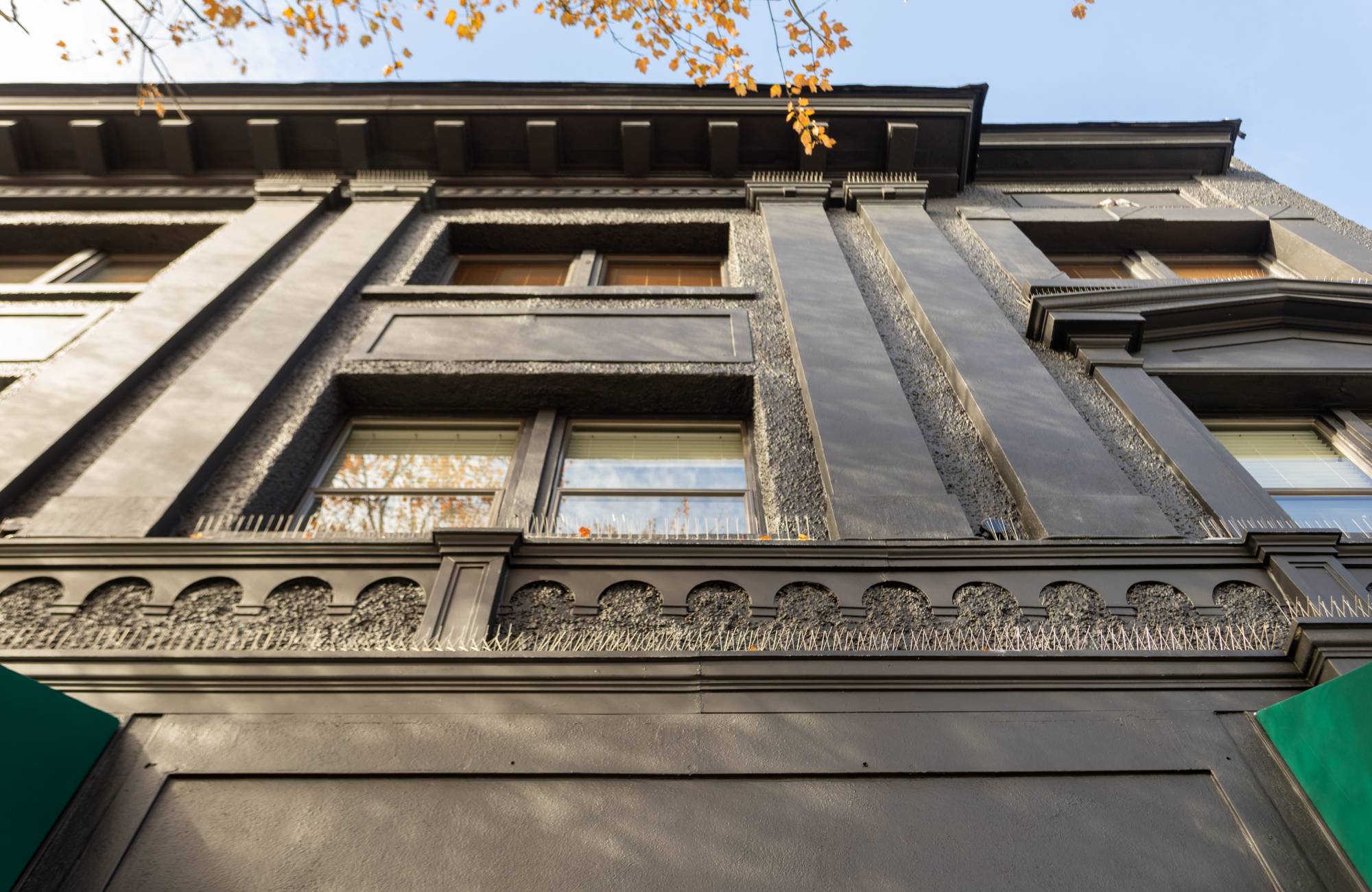
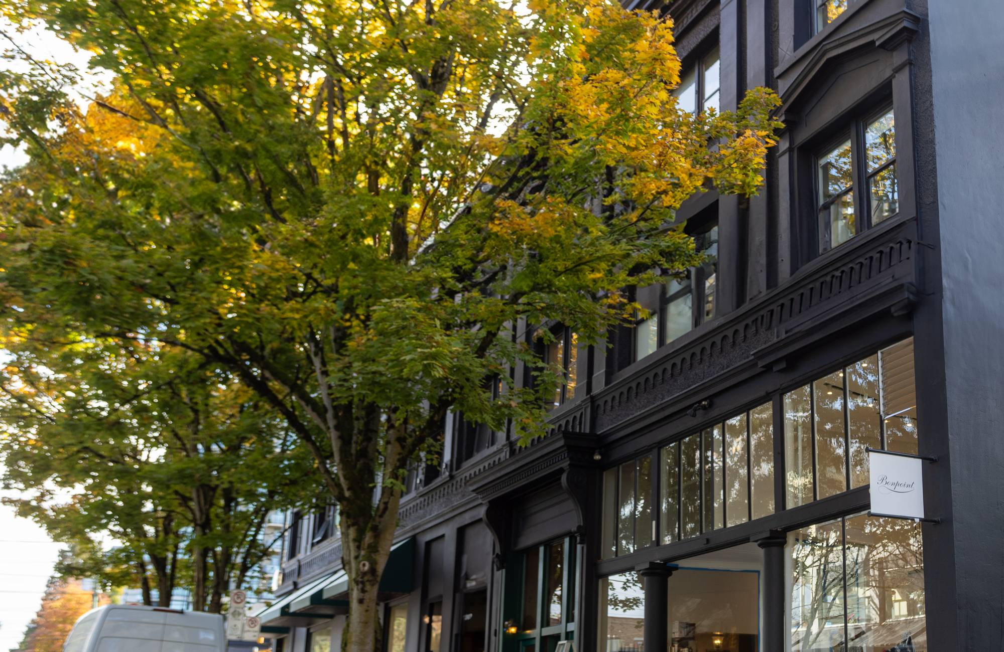
Charcoal Roofing Tones Offset by Light Taupe Walls
Charcoal roofing provides a strong, modern presence that becomes striking when offset by light taupe walls. The dark, smoky tones of the roof create contrast, while taupe walls add warmth and softness to balance the look. This combination offers depth while maintaining a cohesive and inviting exterior.
The pairing also holds practical benefits. Charcoal roofs hide wear better over time, while light taupe walls resist looking dated. Together, they give homes a polished look that endures changing design trends. It’s a combination that blends practicality with visual impact, making it a smart long-term choice.
Muted Teal Accents Combined with Stone Grey Masonry
Muted teal accents provide a refreshing pop of colour when paired with stone grey masonry. The coolness of teal enhances the natural texture of grey stone, creating a lively yet balanced look. This duo feels modern but grounded, bringing energy without disrupting the stability of stone.
The pairing also allows for creativity in accent placement. Teal can highlight doors, window frames, or small trim details against the stonework. Each application introduces personality while the grey keeps the overall style cohesive. It’s a versatile approach for those who want colour that feels intentional, not overwhelming.
Earthy Terracotta Paired with Soft Sage Green Finishes
Earthy terracotta walls glow warmly when combined with soft sage green finishes. Terracotta’s richness grounds the home, while sage introduces a calming, natural counterbalance. This mix captures the warmth of Mediterranean design while also echoing the serenity of garden landscapes.
The balance of earthy and soft tones brings character and charm to different architectural elements. Terracotta gives weight and presence, while sage green highlights features like shutters, doors, or trims without stealing the spotlight. The pairing feels timeless and organic, perfect for homeowners who appreciate natural colour palettes.
Classic Black Railings Contrasting with Subtle Ivory Trims
Classic black railings create sharp contrast when paired with subtle ivory trims. The boldness of black emphasizes structure and detail, while ivory softens the lines, ensuring the look remains approachable. This pairing draws the eye to architectural details that might otherwise go unnoticed.
The combination also works across different styles. In traditional homes, it reinforces timeless elegance, while in modern builds, it delivers sharp sophistication. Black railings stand firm as a statement feature, while ivory trims provide the perfect balance, keeping the entire look polished and graceful.
Bring Out the Best in Your Home’s Architecture with Colour Harmony by Pro Crew Painting Professionals
Homeowners who invest in professional painting see immediate benefits in curb appeal, value, and pride of ownership. Pro Crew Painting specializes in highlighting architectural elements with complementary colours that make a lasting impression. Every architectural detail, from trim to railings, deserves a thoughtful colour pairing that enhances the structure while protecting its individuality. Pro Crew Painting understands how to transform exteriors into standout spaces with carefully planned colour strategies.
Contact us today to bring out the best in your home with painting services tailored to your vision. Pro Crew Painting is ready to deliver results that reflect your taste while ensuring your property stands out with style, quality, and timeless appeal.