When it comes to maintaining the charm and personality of your home, choosing the right paint palette plays a crucial role. The colors you choose should enhance the architectural details while preserving the authenticity of the space. Whether you’re working on a historic home or simply trying to keep the original character intact, the right combination of shades can make all the difference. Let’s dive into some often-overlooked techniques that can help you achieve a timeless, elegant look through interior painting.
Choosing Timeless Shades that Complement Architectural Details
Architectural details are what make a home truly unique, and the right paint shades can enhance these features without overpowering them. Instead of opting for trendy colors, which can quickly go out of style, choosing timeless shades allows your home’s character to shine. Classic neutrals like soft whites, grays, and muted beiges are great for highlighting intricate woodwork, crown molding, or arched doorways.
By sticking to timeless colors, you not only preserve the home’s integrity but also ensure it stays visually appealing for years to come. These classic shades create a clean backdrop that draws attention to the craftsmanship and design elements that make your home special.
Highlighting Vintage Molding with Subtle Contrasting Colors
One of the best ways to preserve the charm of vintage molding is to give it the attention it deserves through contrasting colors. Instead of letting it blend into the walls, consider using a slightly lighter or darker hue to subtly set it apart. This trick works well with both baseboards and crown molding, bringing out the detail without overwhelming the space.
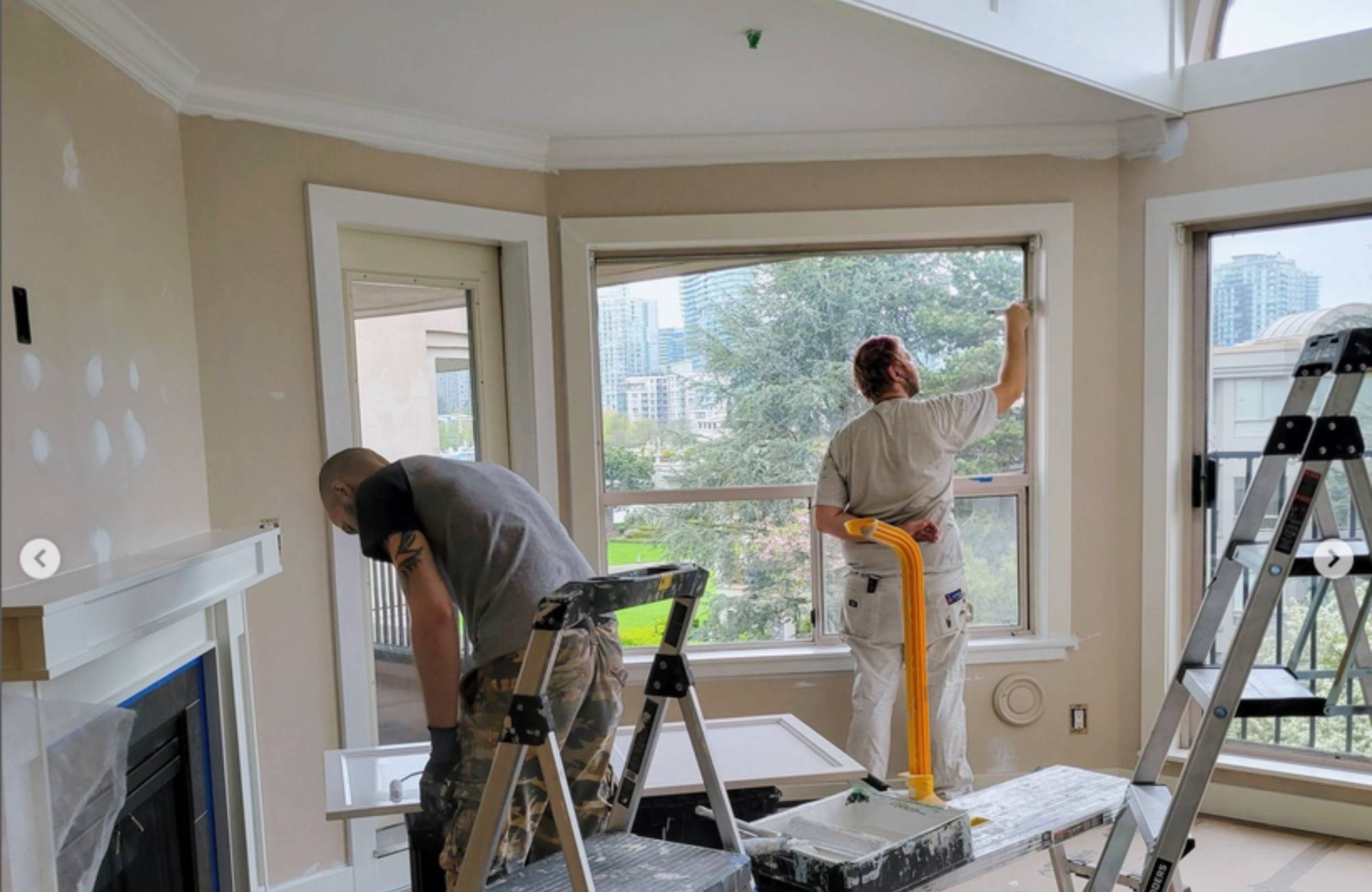
A house painter can help you find the perfect balance between contrast and subtlety. The goal is to maintain the integrity of the molding while adding just enough distinction to make it pop. Soft whites against light gray walls or a gentle cream against a muted pastel can give the room a fresh yet classic look that emphasizes the molding’s beauty without being too bold.
Enhancing Natural Light with Warm, Neutral Tones
Natural light is one of the most beautiful features in any home, and your paint choice should enhance rather than diminish it. Warm neutral tones, such as beige, light taupe, or soft off-whites, can amplify the effect of natural light, making the room feel airy and welcoming. These shades reflect light better than darker tones, creating an open and inviting atmosphere.
An interior painter who understands how to work with light can guide you in selecting the right hues. Light bouncing off neutral tones can brighten a room and give the space a more expansive feel, which is especially useful in older homes where window sizes might be smaller. By choosing the right warm neutrals, you maintain the warmth and character of the space while allowing natural light to be a standout feature.
Balancing Bold Accents with Classic Base Colors for a Cohesive Look
Bold colors can add personality to a room, but they need to be balanced carefully with classic base colors to maintain a cohesive look. Instead of painting an entire room in a bold hue, consider using it for accent walls or specific features like a fireplace or built-in shelving. Pairing these bold accents with timeless, neutral base colors creates harmony and prevents the space from feeling overwhelming.
Interior painting requires striking the right balance between modern flair and classic appeal. A house painter skilled in working with bold accents will help you integrate vibrant shades without clashing with the overall aesthetic. The result is a space that feels fresh and lively while still respecting the original character of the home.
Using Soft Hues to Maintain the Elegance of Historic Interiors
Historic homes often come with a sense of elegance that’s hard to replicate. To preserve this refined atmosphere, soft hues like light blues, greens, or dusty pinks can be ideal. These colors add just enough personality to the space without detracting from the historical details. A well-chosen soft hue can highlight the texture of walls or paneling while keeping the overall look understated and elegant.
An interior painter experienced in working with historic interiors can recommend shades that complement the home’s age and style. By using soft, muted tones, you can achieve a sophisticated look that honors the past while still feeling fresh. These gentle colors ensure that the charm of the home remains front and center, without overwhelming the space.
Blending Modern and Traditional Styles with a Harmonized Palette
Mixing modern and traditional styles can be tricky, but a harmonized paint palette can tie the two together seamlessly. When done right, blending contemporary furniture or décor with classic architectural features creates an eclectic yet balanced look. Opt for neutral base colors like whites or grays, then introduce modern elements through bold accent walls or furniture with brighter hues.
A painting expert can help bridge the gap between these two styles by recommending colors that work well in both traditional and modern settings. Whether it’s using modern pops of color on furniture or walls while keeping the rest of the space classic, a harmonized palette ensures your home feels cohesive and well-thought-out. The right mix of modern and traditional colors keeps the integrity of the space while adding an updated twist.
Accentuating Focal Points Like Fireplaces or Staircases with Deeper Shades
Focal points such as fireplaces or staircases can become the stars of the room when accentuated with deeper, richer shades. Darker hues like navy, charcoal, or forest green can draw attention to these features, giving them a sense of importance without overwhelming the room. Deep shades can add a sense of luxury and depth, making these architectural features stand out beautifully.
An experienced painter knows how to use these deeper shades strategically. By concentrating darker colors on focal points, you create visual interest without detracting from other design elements. It’s a smart way to make certain parts of the room feel more special while still maintaining an overall sense of harmony with the rest of the space.
Layering Textured Finishes to Add Depth Without Overpowering the Space
Texture can be just as important as color when it comes to creating depth and interest in a room. Layering textured finishes like matte, eggshell, or satin paints can bring a subtle complexity to the walls without taking away from the room’s overall character. These finishes can work together to highlight certain areas of a room or add dimension to flat surfaces.
Whether it’s using a matte finish on the walls and a satin finish on the trim, or combining different textures in the same color palette, these subtle layers can make the space feel richer. The trick is to keep the textures balanced so that they add to the room’s charm rather than becoming the focal point themselves.
Elevate Your Home’s Character with a Thoughtful Paint Palette Designed by Experts at Pro Crew Painting
Your home deserves more than just a fresh coat of paint—it deserves a transformation that enhances its unique character. At Pro Crew Painting, our experienced team knows how to bring out the best in your space, whether you’re highlighting historic details or creating a seamless blend of modern and traditional styles. With a keen eye for timeless shades, subtle contrasts, and perfect finishes, we’re the house painters you can trust to preserve your home’s elegance and charm. Let us help you turn your vision into reality with a custom interior painting plan that reflects your style and maintains the integrity of your space. Contact us today to schedule a consultation with our expert interior painters.