Refreshing a home’s exterior doesn’t always require a total makeover. Sometimes, a well-thought-out colour scheme can completely shift how a house feels, even from the curb. Whether you’re repainting for the first time in years or just itching to add a bit of charm, exploring unexpected hues can breathe life into tired exteriors. It’s all about choosing colours that reflect your personality while still harmonizing with your surroundings.
Earth‑Grounded Greys and Charcoals
Greys and charcoals are more than just safe choices—they bring depth and sophistication without being flashy. These earth-grounded tones work beautifully with natural elements like stone, brick, or wood. A warm charcoal base paired with lighter trim can make a home look polished and intentional. These colours also hide dust and dirt better than bright whites or pale hues, which is a win for low-maintenance living.
What many homeowners don’t realize is how versatile greys can be depending on their undertone. A soft, mossy grey can blend with gardens and greenery, while a cooler slate can modernize an older build. With proper colour coordination, even a traditional home can feel fresh and current just by deepening its exterior palette.
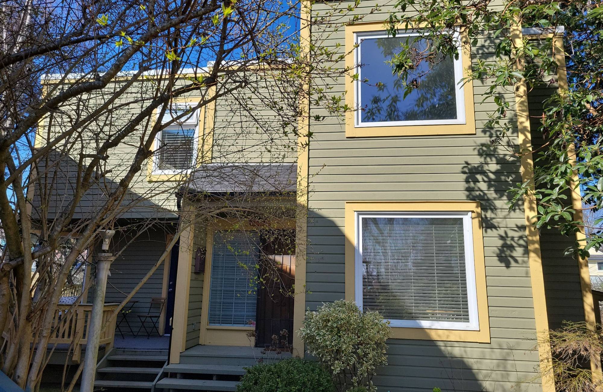
Creamy off‑Whites with Warm Undertones for a Welcoming Façade
Not all whites feel sterile. Creamy off-whites with warm undertones bring comfort and brightness to a façade without blinding the eyes. These shades pick up natural light beautifully, softening the overall look of the home while still keeping it clean. They also pair well with both traditional and modern materials, from red brick to smooth concrete.
Using warm off-whites helps create a more inviting entrance. They don’t reflect harsh shadows and instead highlight details like trim, gables, or front porches. In a professional colour consultation, these shades are often chosen for their balance—they warm up the exterior without pushing it too far into yellow or beige territory.
Deep Navy and Inky Blues That Frame Trim or Doors
Deep navy and inky blues add a rich, bold contrast to a home’s exterior without taking over the entire look. They work especially well on trim, shutters, or front doors—places where you want to draw the eye without overwhelming the structure. These colours feel timeless but still carry a sense of drama that makes an impact.
What many people overlook is how good navy looks alongside natural textures like wood, brick, or stone. When used with the right colour coordination, these dark blues can elevate siding and frame architectural lines with subtle boldness. A navy door surrounded by creamy siding or soft stone gives a home character and curb appeal without needing full saturation.
Rustic Browns Inspired by Cedar and Rich Timber Tones
There’s something grounding about deep, natural browns—tones that reflect cedar, mahogany, or weathered wood. These colours bring out a rustic charm that connects the home to the land around it. Whether used on siding or accents, these rich tones create an earthy, calming impression that ages beautifully.
Rustic browns are ideal for homes surrounded by trees, hills, or garden-heavy spaces. They don’t clash with their surroundings but instead enhance them. A colour consultation might reveal how layering different shades of brown—say, a deeper trim paired with a softer taupe body—can bring warmth and balance to a property’s overall look.

Accent Shades like Soft Sage, Blush Pink, or Tangerine for a Touch of Personality
Sometimes, all it takes is a pop of colour to bring a house to life. Accent shades like soft sage, blush pink, or even a playful tangerine can add personality in just the right dose. These colours shine on doors, shutters, or flower boxes, and they offer a touch of charm without overwhelming the overall scheme.
The trick is to keep the base neutral and let the accent colour add the fun. Sage brings a sense of peace, blush adds softness, and tangerine brings vibrancy. A thoughtful approach to colour coordination ensures these bolder hues don’t clash but rather highlight architectural features in a way that feels personal and inviting.
Cinnamon Slate Hues Merging Plum and Velvety Brown
Cinnamon slate isn’t a colour many people name off the top of their heads—but it deserves more attention. This unique shade merges the warmth of brown with subtle hints of plum, offering a rich, velvety look that changes slightly depending on light and time of day. It’s bold without being flashy and blends well with both warm and cool tones around the property.
This kind of colour brings depth and elegance to a home’s exterior, especially when paired with soft neutrals or natural wood. It stands out in a refined way, making it perfect for those wanting something different but still tasteful. A seasoned colour consultation might suggest this hue for someone looking to shift away from standard neutrals without leaping into brights.
Subtle Bicolour Schemes Pairing Greige or Stone Tones
Two-tone exteriors don’t have to be loud. Subtle bicolour schemes using shades like greige (a soft grey-beige) or gentle stone tones can give a home structure and style. Pairing a deeper tone on the lower half of the house with a lighter tone above adds dimension without feeling split in half. It subtly defines the architectural lines and keeps the eye moving upward.
Homeowners often underestimate the power of layering tones from the same colour family. With the right balance, bicolour combinations can be both soothing and modern. In terms of colour coordination, using this method creates interest and sophistication without risking trend fatigue.
Landscape‑Inspired Palettes
Nature is the best designer—so looking to the landscape for inspiration just makes sense. Colours drawn from the surrounding area like dusty green, soft sand, muted clay, or faded sky blue help homes feel connected to the earth they sit on. These tones often shift with the seasons, making the home feel alive and ever-changing with its surroundings.
Landscape-inspired palettes work especially well for homes in rural, coastal, or mountainous settings. By mimicking the hues found in nearby foliage, rocks, or skies, the home feels like it belongs exactly where it is. These colours don’t shout—they settle in. That kind of colour coordination helps a house feel intentional and part of a bigger picture.
Give Your Home a Beautiful and Thoughtfully Painted Makeover with Pro Crew Painting
Choosing the right exterior colour isn’t just about picking paint chips—it’s about shaping how people feel when they see your home. Whether you’re leaning into earthy tones, experimenting with bold accents, or finding harmony with your landscape, Pro Crew Painting helps bring that vision to life. Our expert painters handle each home with care, combining years of experience with top-quality finishes and a real understanding of what makes a space feel special.
Don’t settle for guesswork or rushed DIY jobs. A perfect paint job starts with clear guidance, clean preparation, and reliable hands. Pro Crew Painting works closely with homeowners to deliver results that last—both in colour and quality. Contact us today to schedule a consultation and see how Pro Crew Painting can refresh your home’s exterior with precision and style.